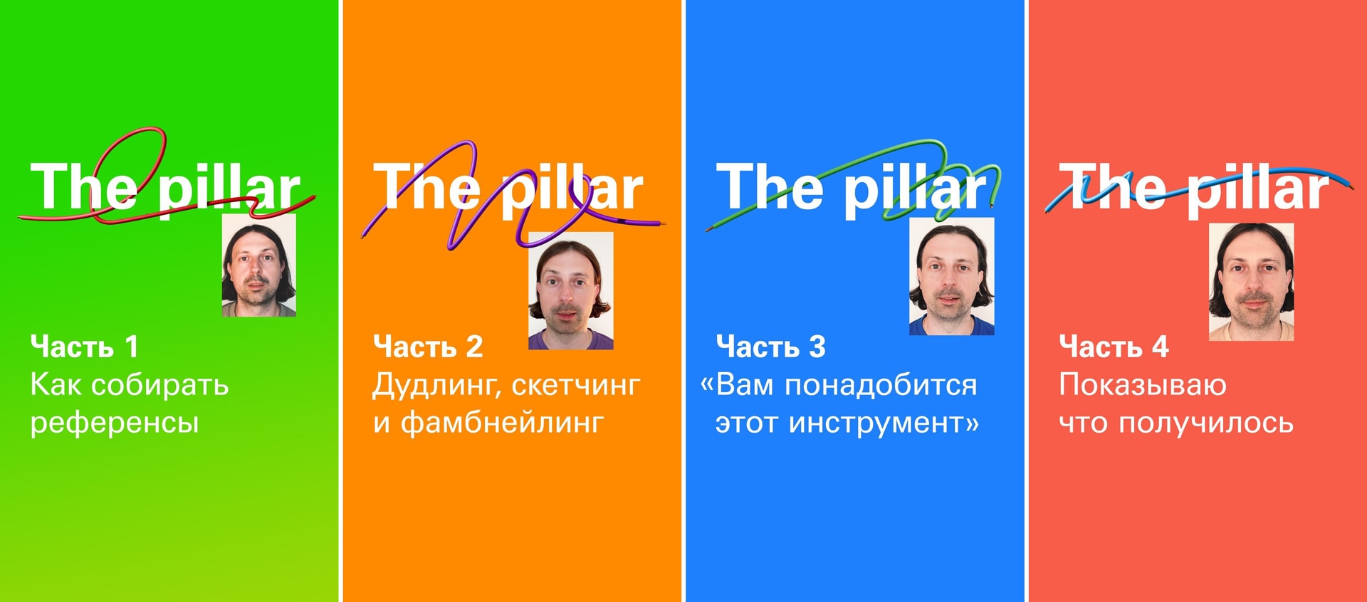
19 08 2024
This lengthy post is about creating a 3D illustration of a “pillar” and my learning process during the course (which was also a summer 3D camp) at the school led by Misha Katz. I’ve described and illustrated all the stages of the creation process—from the initial sketches to the final render
My Context
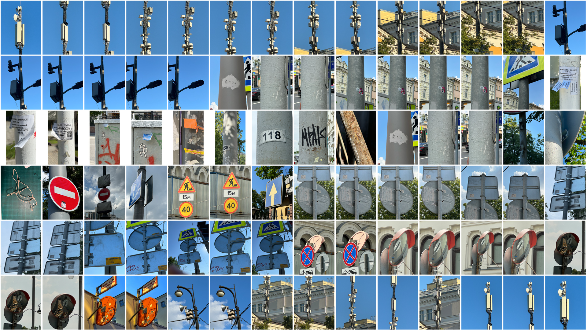
During the creation of this project, I spent time in three major cities. I observed the poles around the city and found various attachments—signs, lights, traffic signals, servers, technical markings, artist stickers, and their messages. I shifted my focus from the specific to the general, examining the technology, overall condition, and whether things were worn or new. Each city has its own character, heroes, and approach to infrastructure. In Yekaterinburg, modernity is favored; in St. Petersburg, the attitude is «as long as it works for people»; and Moscow is all about the future. From these three places, I drew my own impressions and tried to project their attributes into my work.
At the center of the composition is a pillar—it’s mine, but it also connects to someone else’s. I like the idea that I am part of a larger chain while still maintaining my individuality. On one hand, there are strict boundaries, but on the other, there’s a wealth of possibilities. It’s like a relay race—you take the baton, run your segment, and then pass it on. You’re competing and collaborating at the same time. I enjoy this balance.
Research and Reference Gathering
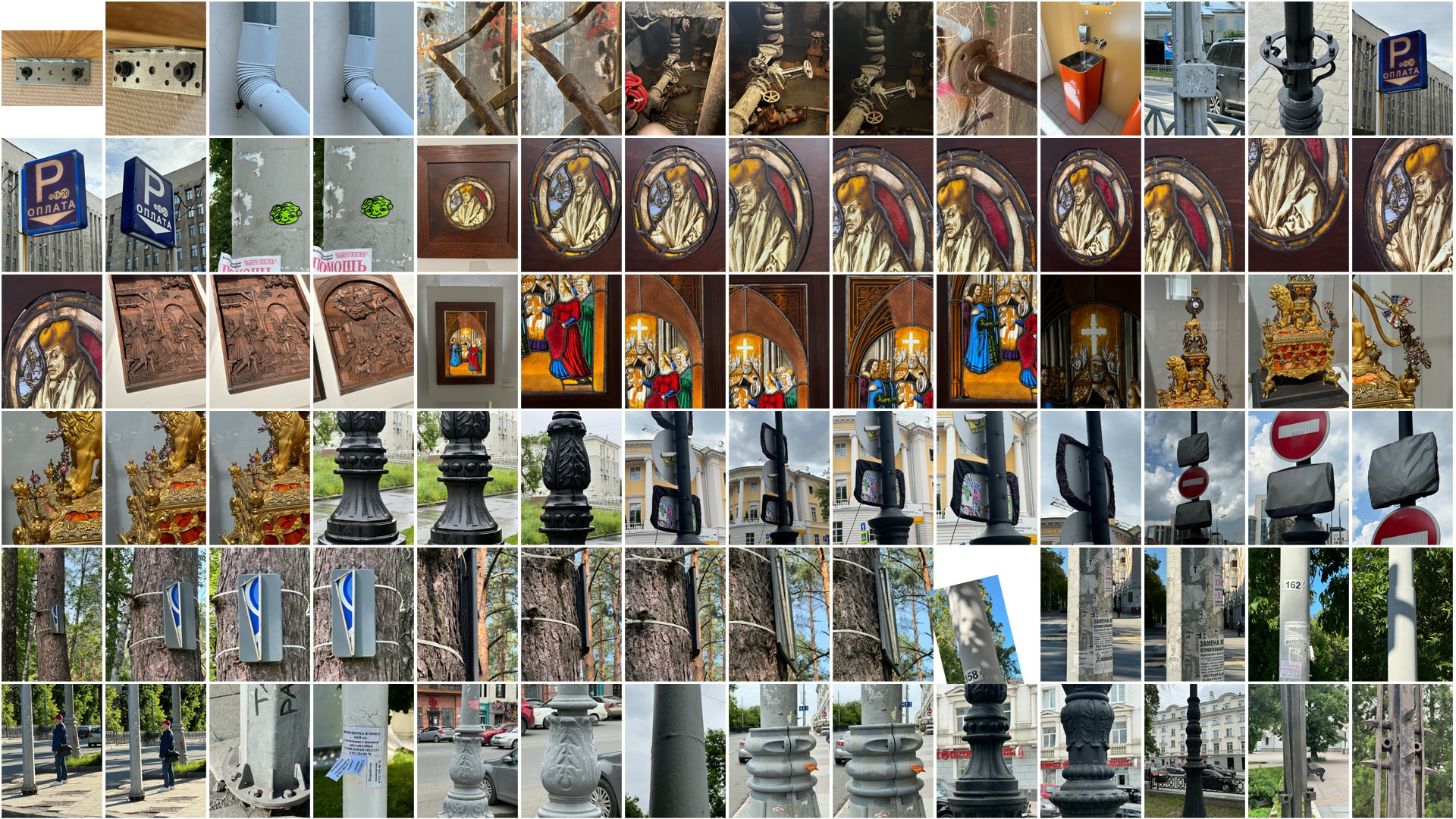
The first task was to gather references. I generally love references, especially on Pinterest. But this time it was different—I had to find them in real life and capture them myself. This approach added a unique quality to my work (and not just mine).
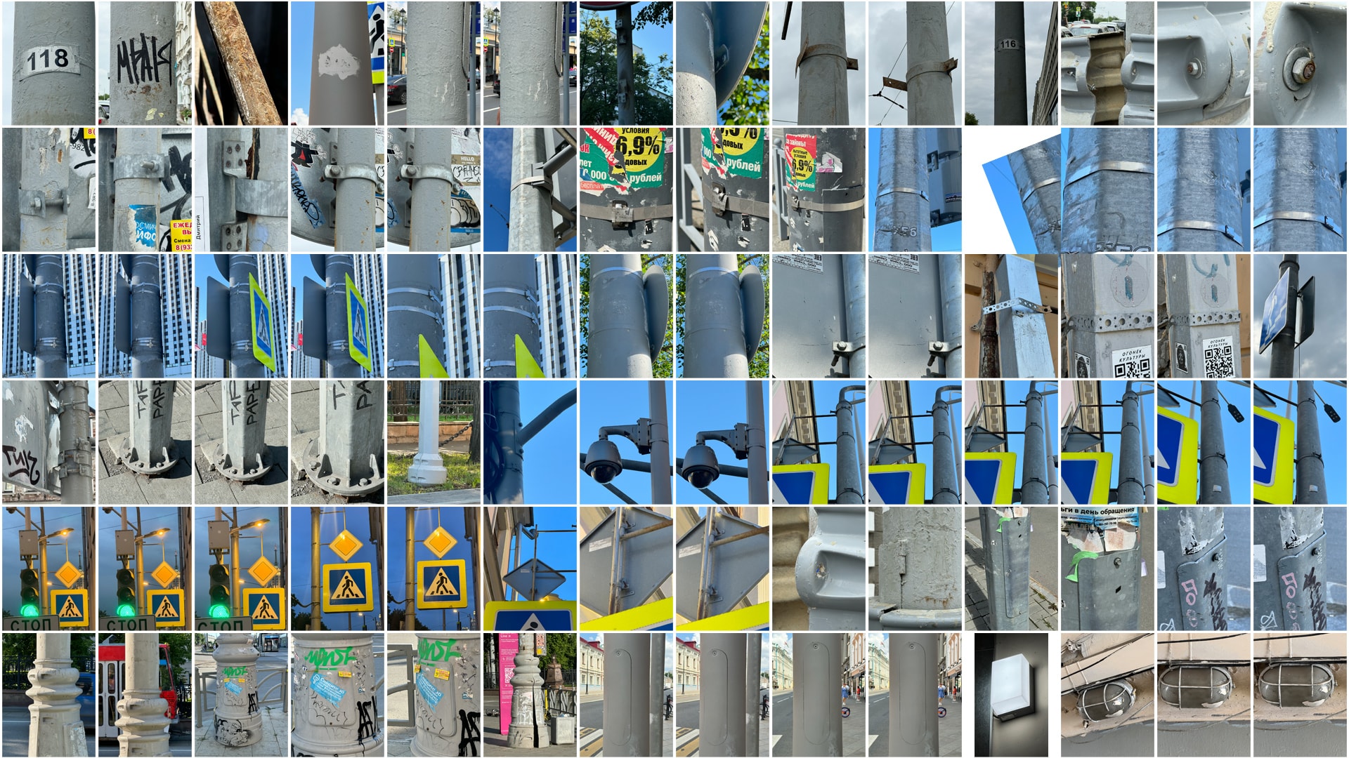
I organized all the interesting photos into folders, categorized them, and created a comprehensive presentation in Keynote. This way, I had a clear structure and could easily share it with Misha.
Even after completing this stage, I continued to collect files. In fact, I’m still fascinated by poles. Especially now that we have the «pillar» community.
Concept Development and Initial Sketches
I began working on the first sketches while I was in Yekaterinburg, and it took me by surprise—I didn’t have my notebook, sheets of paper, my large desk, or any materials. All I had was a pen and my paper planner. I found some blank pages somewhere around «January» and started sketching out my initial ideas.
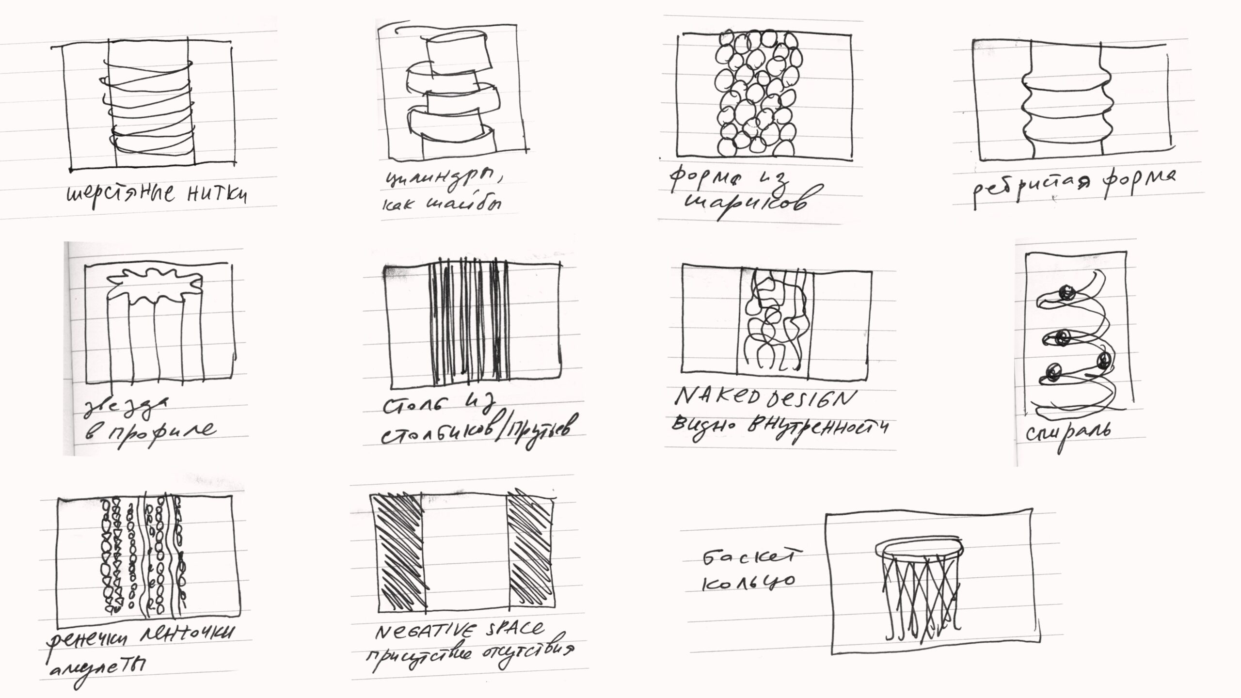
Woolen threads; Cylinders, like washers; Shapes made from spheres; Ribbed forms; Star in profile; Pillar made of tables/sticks;NAKED DESIGN; Spiral; Bracelets, ribbons, amulets; Negative space: the presence of absence; Basketball hoop
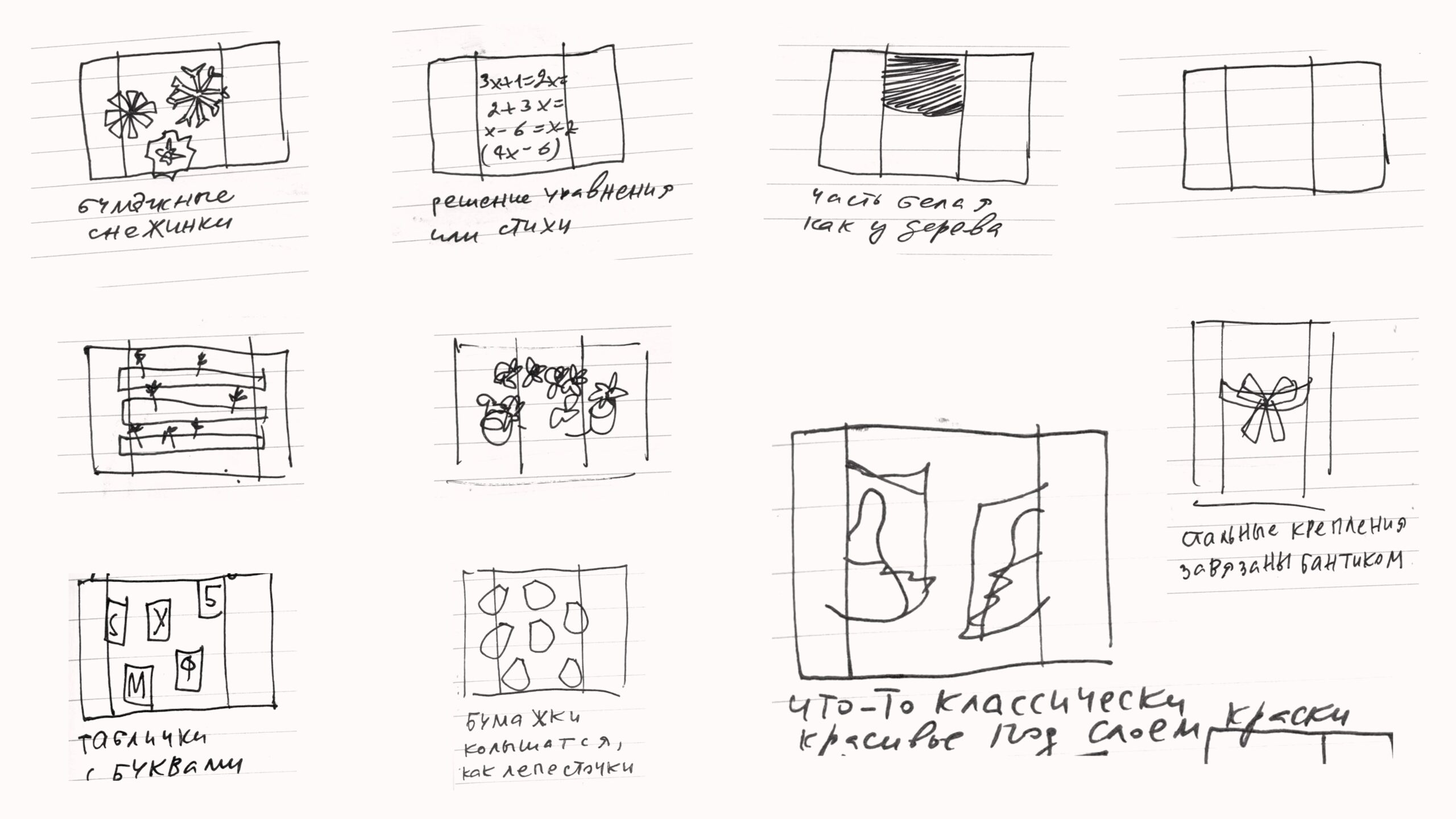
Paper snowflakes; Solving equations or poetry; A white painted part like that of a tree in summer; Steel fittings tied with a bow; Lettered plaques; Papers fluttering like petals; Something classically beautiful beneath a layer of paint
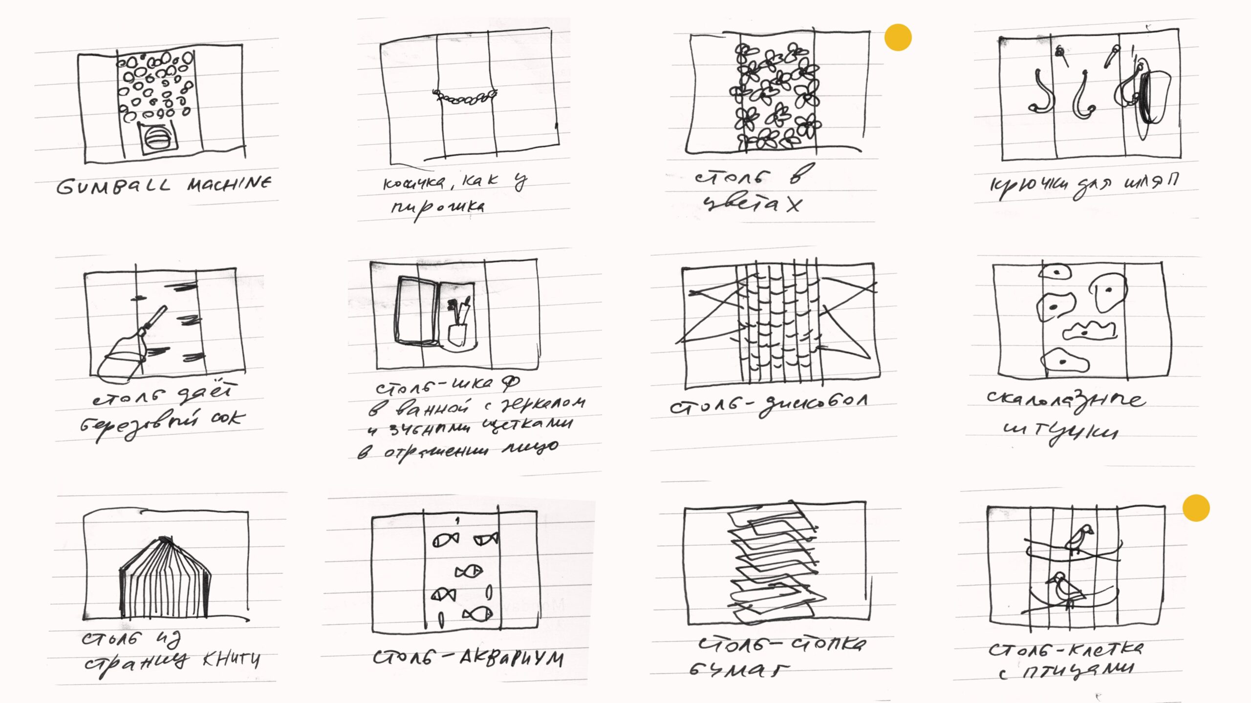
Gumball machine; Braid, like that on a pastry; Pillar in colors; Hat hooks; Pillar giving birch sap; Pillar-cabinet in the bathroom with a mirror and toothbrushes reflecting a face; Pillar-discus thrower; Climbing gear; Pillar made of book pages; Pillar-aquarium; Pillar-pile of papers; Pillar-cage with birds.
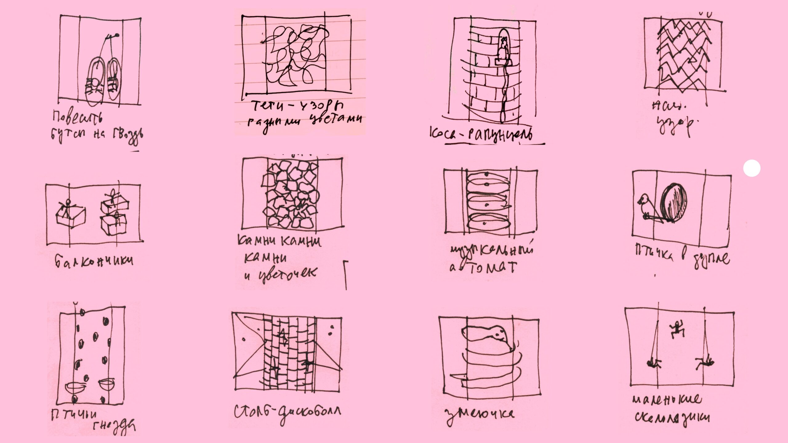
Hang the cleats on a hook; Graffiti tags with patterns in various colors; Rapunzel’s braid; National patterns; Bows; Stones, stones, stones, and a flower; Jukebox; Bird in a hollow; Bird nests; Pillar-discus thrower; Little snake; Small climbing holds.
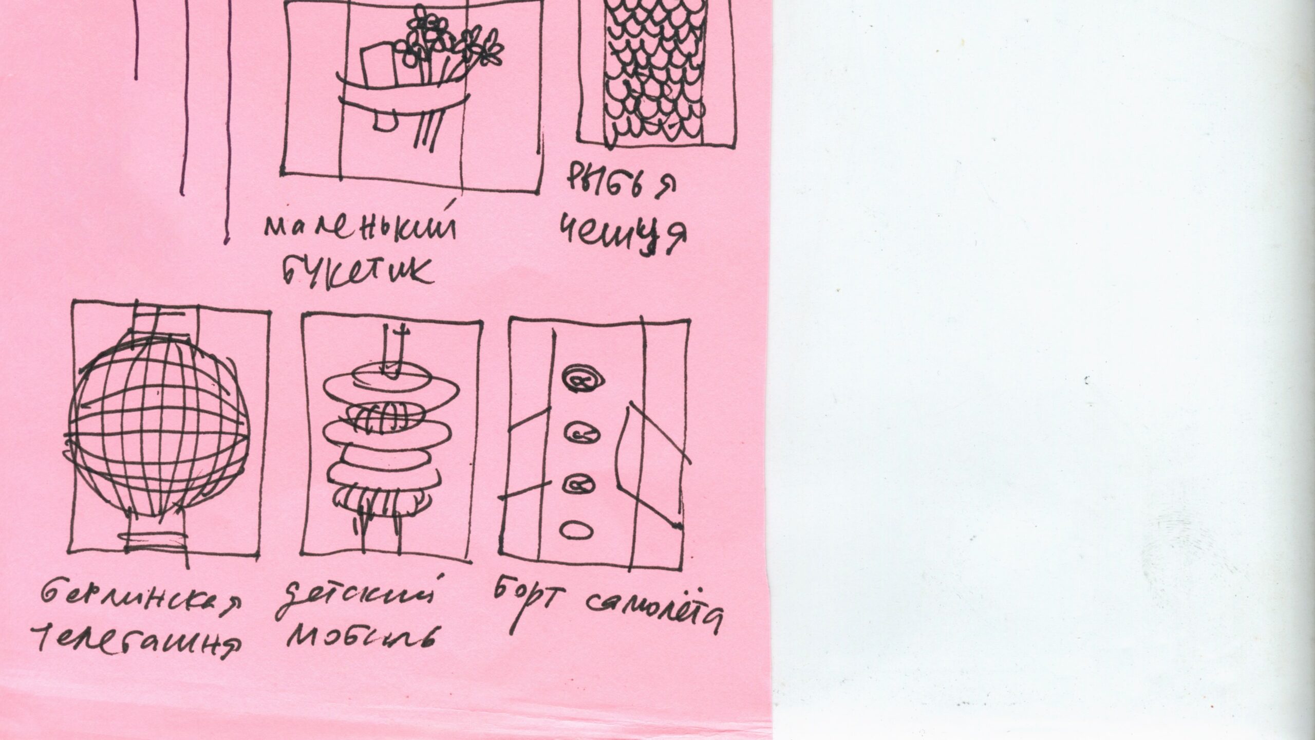
Small bouquet; Fish scales; Berlin TV Tower; Baby mobile; Airplane wing
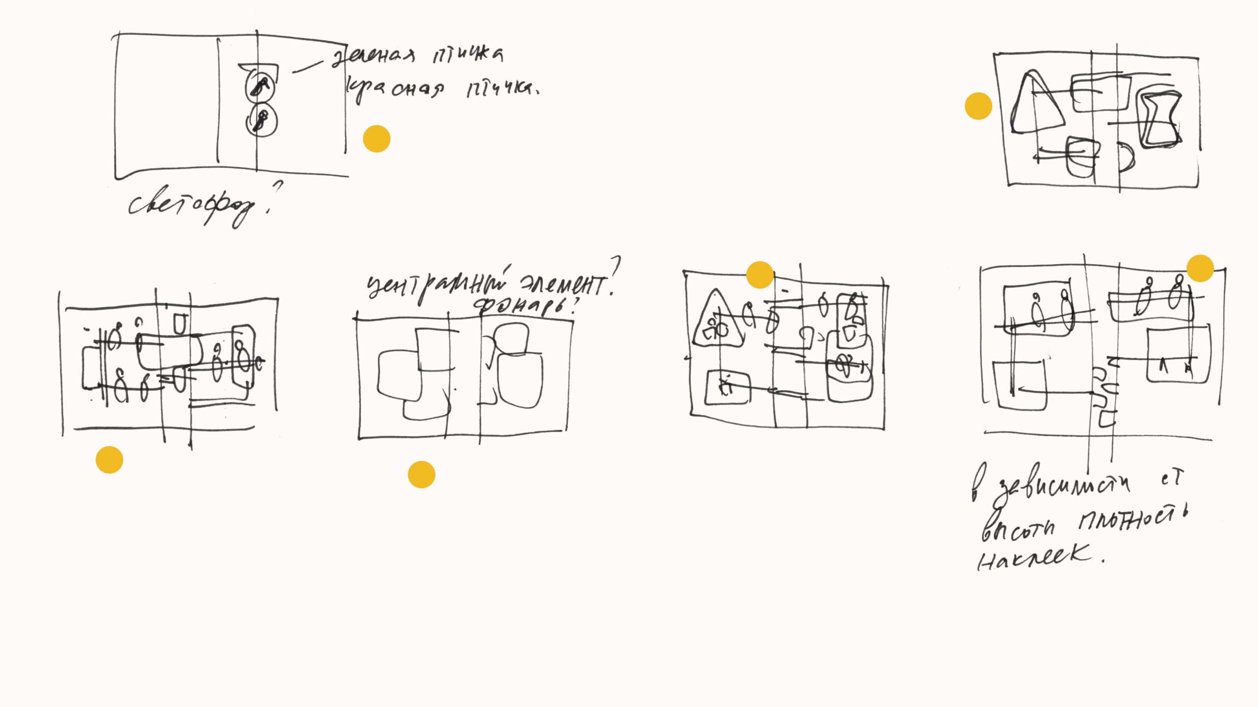
By this point, it was clear that I had settled on the composition in these sketches. I decided that there would be signs, birds, and stickers. Ultimately, the idea of stickers was dropped; I had envisioned creating a large number of them, similar to leaves on a tree.
Creating 3D Models
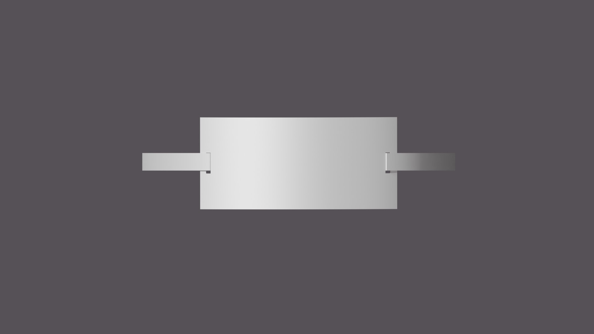
We transitioned from the «black» and «raw» process to something more aesthetic and concrete. We became acquainted with Plasticity. It’s truly magical. This software is incredibly convenient for modeling «hard surface» objects. I really like how it handles edge rounding, extrusion, and cutting. Everything is very clear and intuitive.
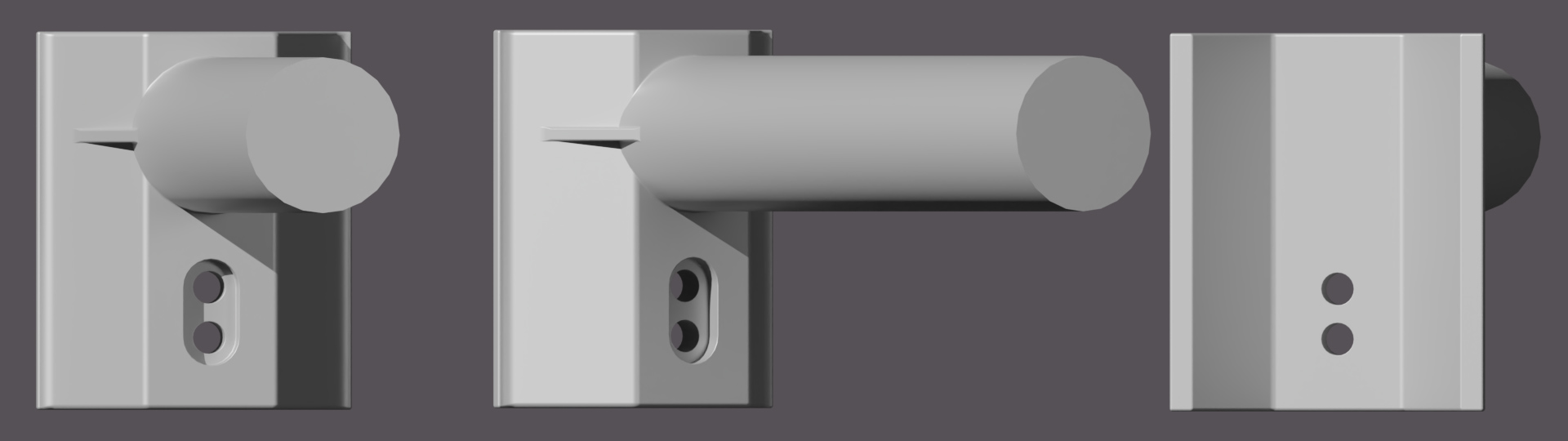

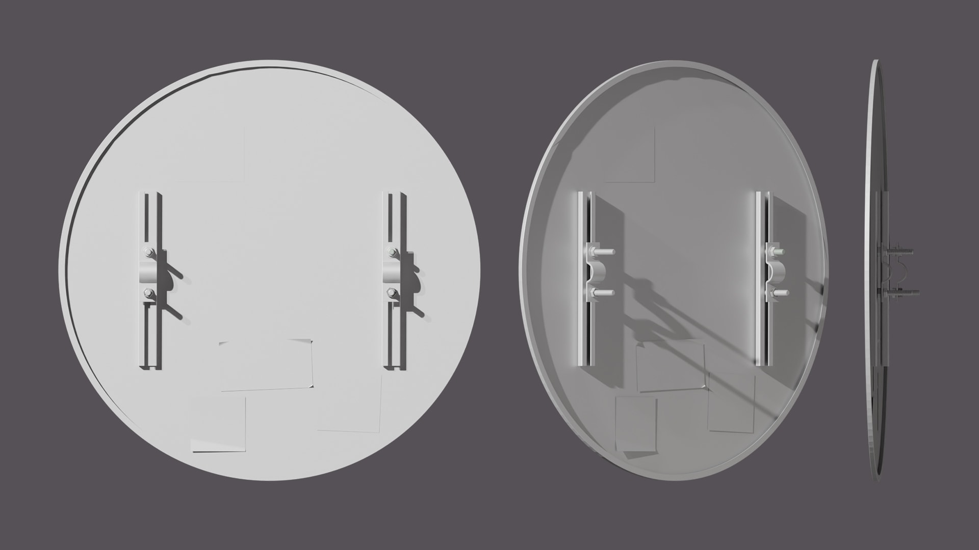
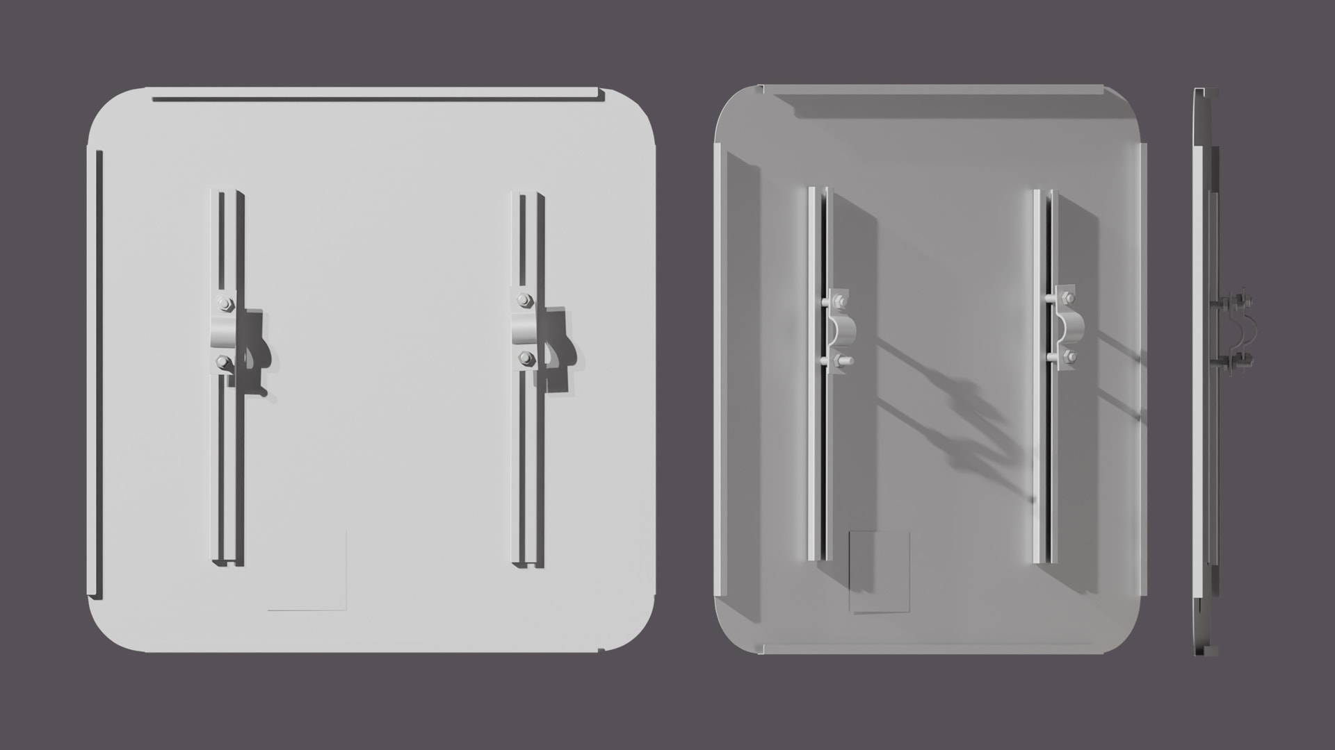
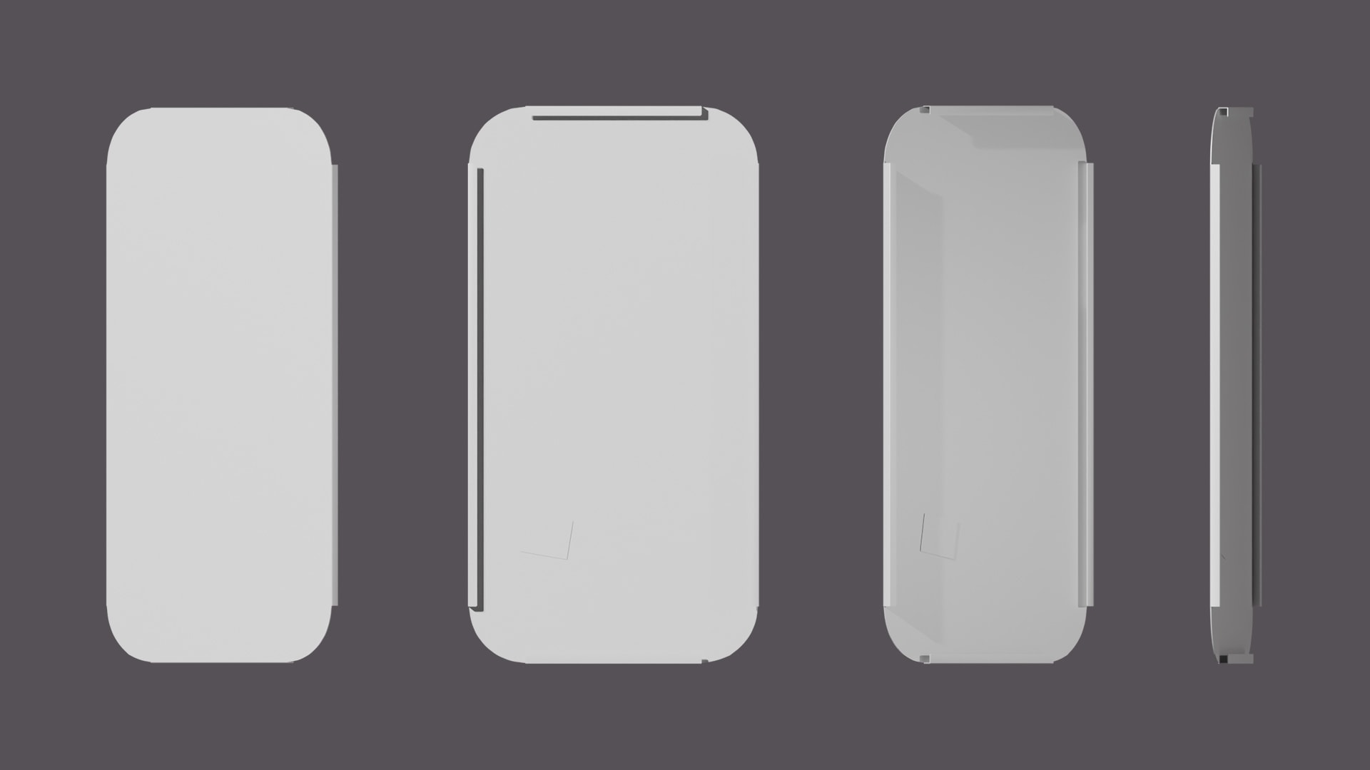
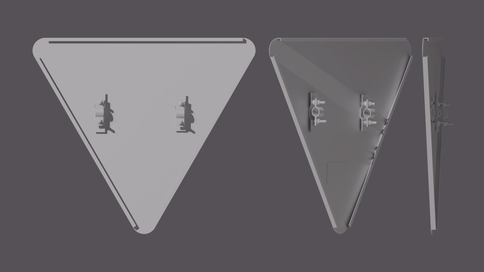
I wouldn’t even attempt to model such attachments on signs in Blender or Cinema 4D, or I would spend an enormous amount of time on all the bolts, nuts, and washers.


I created this cable in Blender because I needed to bend it during the process to fit it around the pillar’s details. Therefore, a pre-made polygonal model wouldn’t have worked for me.

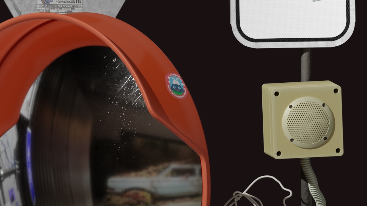
The speaker is my pride. I saw it in St. Petersburg and thought it would fit perfectly into my scene.


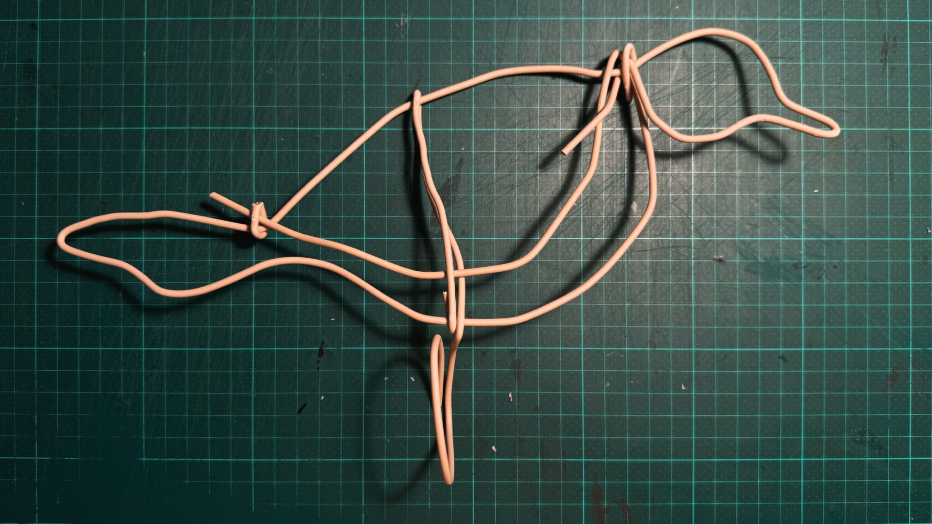
The birds are a distinct and crucial element of my illustration.
Bird Sculpture
To make the bird look natural and «wire-like,» I decided to create it myself using real materials—specifically, a power cable. This approach helped me better understand how to build the model in Blender later on. I could see where the bends, necessary breaks, and irregularities should be.
Process Timelapse
From the first to the prefinal render, from July 7 to August 8.
Final Render
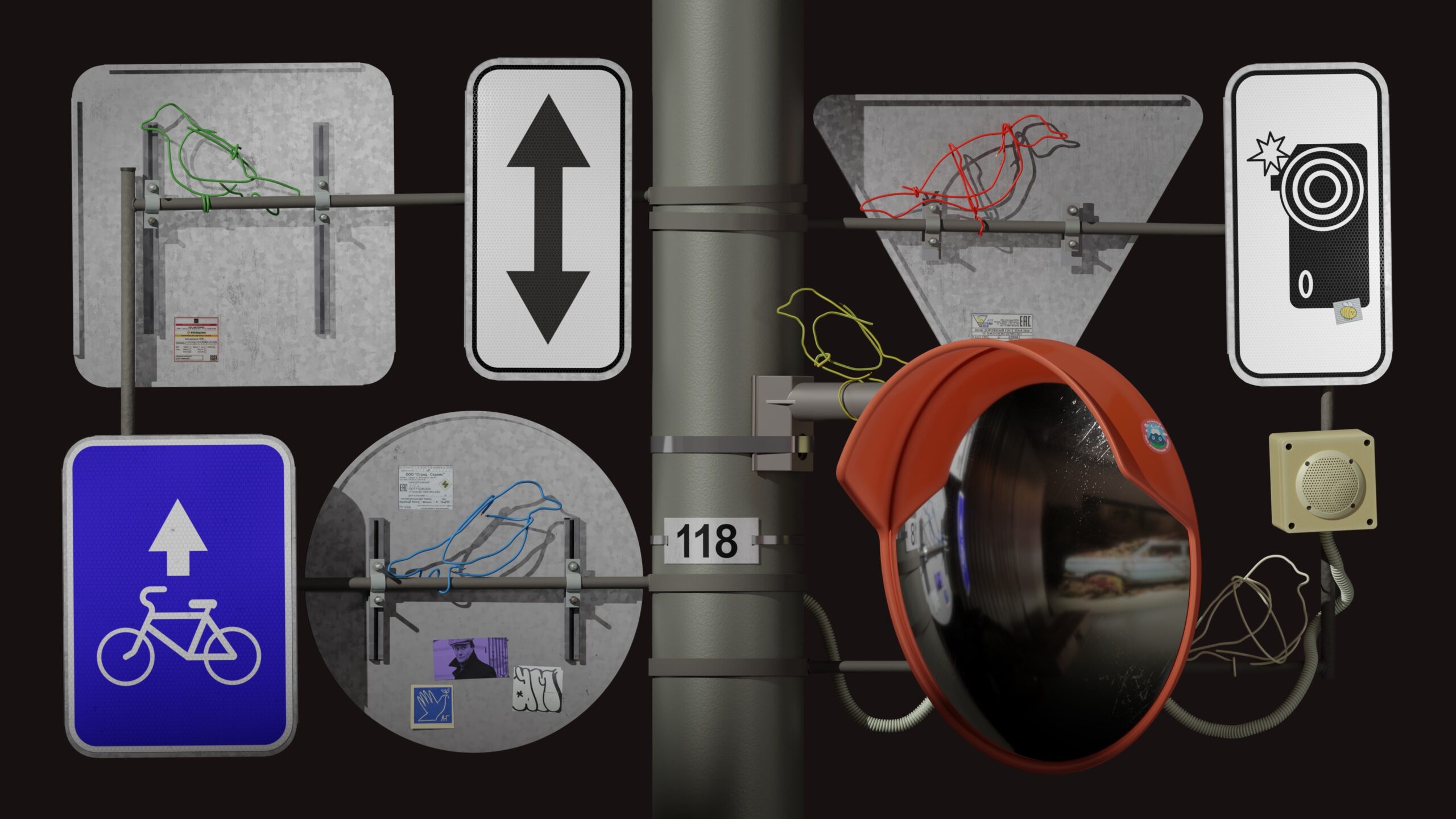
Honestly, I wasn’t eager to hit the final render button and name the file …FINAL.png. It was too engaging to stop. But here it is—my final render, featuring my wire birds on the pillar with road signs in the background.
I really love the glare on the reflective part of the sign. I’m quite proud of such details.
The scratches on the mirror effectively highlighted the volume and clarified that it’s not a dark void.
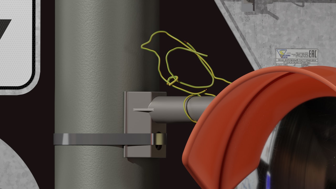
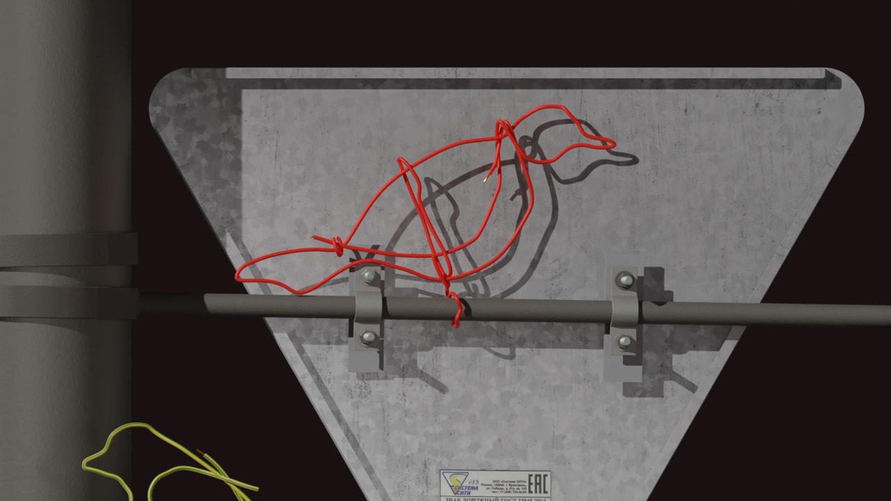
I created a two-tone yellow-green cable, just like in real life.
The glare on the exposed copper part is simply stunning!
Concept Description
For me, birds symbolize beauty, freedom, simplicity, lightness, fragility, color, and variety. For some reason, they are my favorite creatures in the animal world. That’s why they are featured on my pillar. I chose wire to create them because I wanted a tangible story that could be imagined in a city setting, where an artist has come and created a piece of public art. Real-life «lovebirds» wouldn’t have landed there..
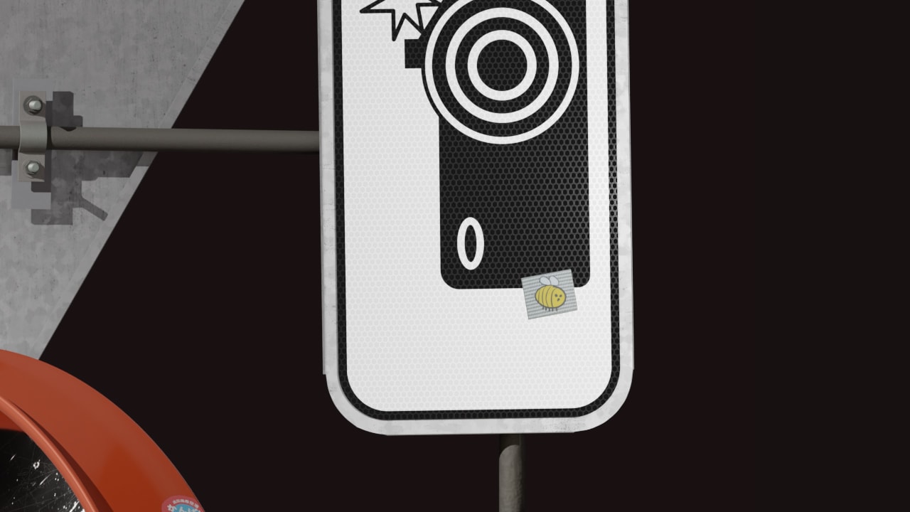
As for the road signs, they represent the pinnacle of graphic design for me—the quintessential example of graphic design. An arrow pointing left, an arrow pointing right, what’s allowed, what’s not, and so on. While I wasn’t thinking specifically about these elements when placing them, they provided a necessary backdrop for my birds, creating their environment. And, secretly, I enjoy the UI (design) technique of the bento box, with many blocks featuring rounded corners and some content inside. This seemed like a great place to apply that concept in a non-trivial way.
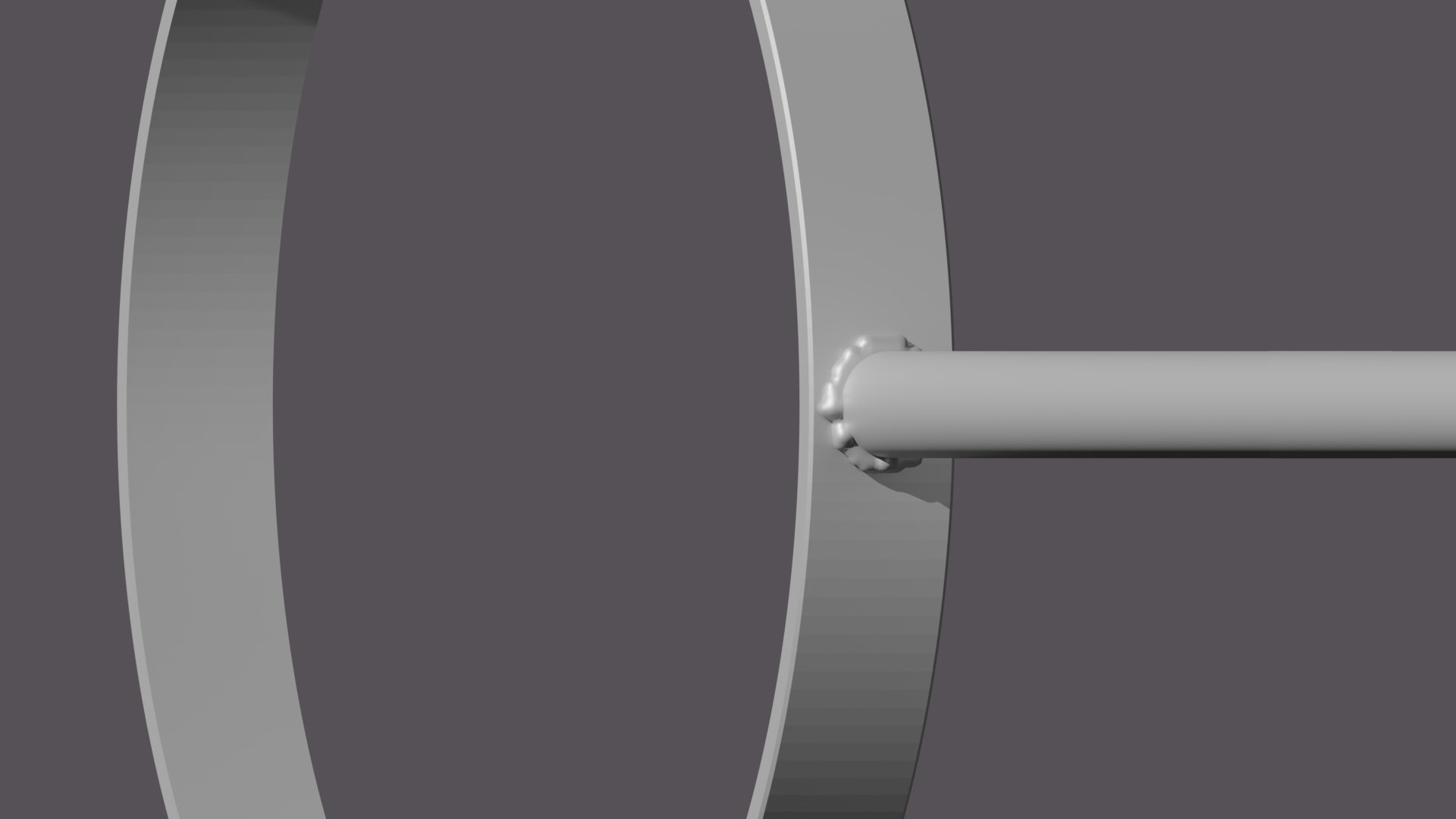
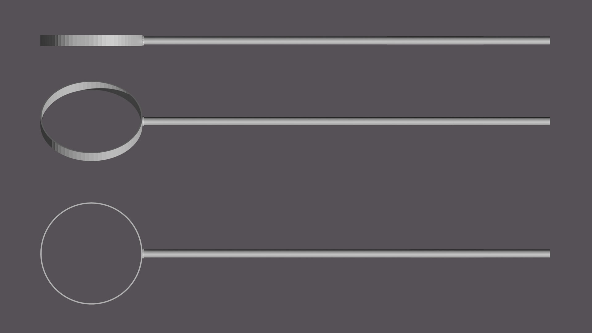
A speaker appeared—these are often seen in St. Petersburg for announcing pedestrian traffic signals. I really liked the shape, and the speaker also has a musical connotation. The mirror: I needed a large round object to complement the round sign, and bright orange was very fitting. Additionally, a mirror reflects themes of ego and the artist’s narcissism, which is a metaphor I find relevant.
Stickers. Technically, I needed color spots. While deciding which ones to use, I came across a blue image by Nikita Lukyanov next to my desk that matched well with the signs. It reminded me of the first sticker for the studio by Nikita Vasilevsky, which has bright red edges and fits perfectly with the orange mirror. So, I ended up using these two stickers from the two Nikitas. I also added a portrait of Andrei Mironov, which is my own addition. Such a sticker doesn’t exist or hasn’t existed before. Additionally, there’s another sticker with a «Throw Up,» which was placed near the studio.
Community
It’s very important to note that I wasn’t alone throughout this process. Our collective pillar comprised 22 participants.
We communicated in the chat, participated in streams, asked each other questions, and shared knowledge, concerns, and joy. In essence, our creative «pillar community» was born, and I want to say «thank you» to each of you. We learned from each other throughout this journey.
@mish.katz
@nobodyroo
@volv_victory
@pterodactyl.supplies
@_fragileisland_
@i_am_benesh
@mtlknv
@nananast
@bres.wk
@lossless.motion
@rustam_works
@maryna.yanul
@rinartio
@dima_bsdn
@romarugach
@theslightlyblack
@m.mokshantseva
Afterword
What I took away from this process:
- — I can still be amazed and delighted by new things even after twenty years in design.
- — Great results can be achieved with simple tools.
- — The process is my key.
- — I can create impressive 3D graphics!
Software I Used
Plasticity, Blender (4.2), Adobe Photoshop, Adobe Illustrator
Afterword (II)
On this website, you can explore the work of all participants in “The Pillar” project. Definitely check it out—it’s truly fascinating!
I created a series of Instagram reels where I talk about the process behind this work in my own voice. Check them out too!